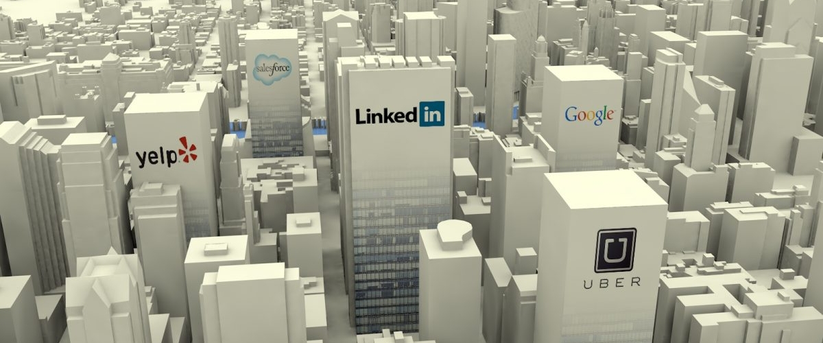
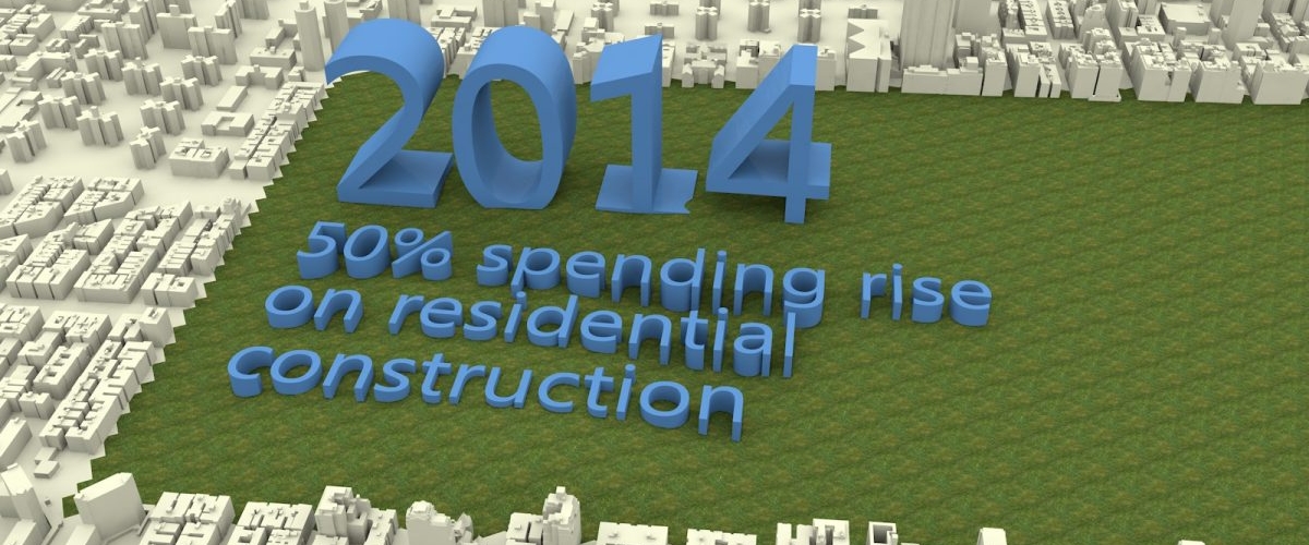
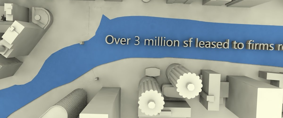
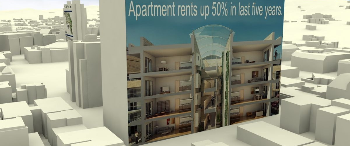
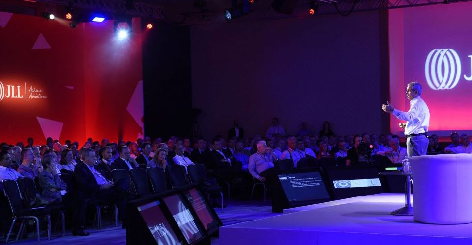
Our brief was to create a short punchy animation with music that could be used at internal and external events by our client. It needed to showcase three main US cities, demonstrating market growth in investment and real estate, using key statistics and lots of movement !
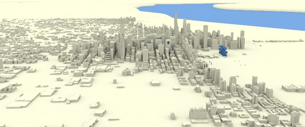
A challenging and time consuming project,at times, for our graphics team, this involved an initial search for an adaptable 3d model of the main land mass of America. We then choreographed and manipulated the various moves and fly through of each city.
Timings were critical, as each city would feature a handful of applied graphics to buildings and roadways, allowing the viewer to be able to read and absorb all the information.Lighting and shadowing also had to be taken into account, so that the finished piece looked perfect on a variety of different screen applications.
After several initial design styles were generated, the client settled on a more stripped back ‘white card’ version as a final piece, helping emphasis the applied graphics and effects.
The piece was well received during its various uses.
